Create a One-Page Retro Web Design Layout in Photoshop
Posted by
vkdt
at
Friday, May 22, 2015
In this tutorial we will explain how to create a one-page retro web design using Adobe Photoshop. While most of the design is created in Photoshop, we will also use Illustrator to create various shapes and elements. Let's get started!
This tutorial was a collaboration withCiursa Ionut.
Tutorial Assets
The following assets were used during the production of this tutorial.
In this tutorial we will use the960 Grid System. Download it and unzip the archive file. Then go to the "Photoshop" folder (inside "templates"). There you will find all the .PSD files. For this web design we will use the 12 columns grid.
After you open the .psd file in Photoshop you will see 12 red bars. That is the grid that we will be using. You can hide the red bars by clicking on the eye icon of the “12 Col Grid” layer.
During this tutorial I will ask you to create shapes with certain dimensions. Open the Info panel (Window > Info) and when you create a shape you will see its exact width and height in this panel.
The .PSD file contains some guides as well which will be very useful. To activate them go to View > Show > Guides, or use the shortcut Ctrl/Cmd + ;. I usually hide the red bars and activate the guides whenever I need them.
The grid will help us apply the alignment design principle, which states that every element of the design should be visually connected with another one and nothing should be placed randomly.
Now that we covered the basics of using the 960 Grid System, we can move on to creating the actual web layout. If you want to find out more about the 960 Grid System you can read a morecomprehensive guide.
Step 1 - Setting up the document and creating the background
Open the "960_grid_12_col .psd" file in Photoshop. We need more space to work with, so we will have to increase the canvas size. Go to Image > Canvas Size (Ctrl/Cmd + Alt/Option + C). Set the width to 1200px and the height to 1700px. Then click on the upper middle anchor point. That is the point the image will expand from.
Now we will create a pattern which is going to be applied to the website background. Create a new document (Ctrl/Cmd + N) with the dimensions 1px by 3px. Then create a new layer (Ctrl/Cmd + Shift + N).
Zoom in and use the Rectangular Marquee Tool (M) to create a 1px by 1px selection at the top of your document. Fill this selection with black using the Paint Bucket Tool (M).
Hit Ctrl/Cmd + D to deselect. Hide the "Background" layer and go to Edit > Define Pattern. Now you can close this document.
Go back to your web design document and hide the "12 Col Grid" layer, but always keep it at the top of the Layers panel. This way you can activate it and check if the elements of your web design are aligned to the grid.
Go to Layer > New Fill Layer > Solid Color and set the color to #f2f1ed. Name this layer "Main background". We will apply a noise filter to this layer, but we don't want to rasterize it. Instead we will use a smart object, so we can edit the filters later on if needed. It is always a good practice to work as non-destructive as possible and keep everything editable.
Right-click on the "Main background" layer and select Convert to Smart Object. Then go to Filter > Noise > Add Noise and use the settings from the image below. Double-click on this layer to open the Layer Style window and apply the pattern you created. This will give us a subtle cardboard texture which we will use throughout the entire design.
Step 2 - Creating the header background
Create a new group (Layer > New > Group) and name it "Header". Create another group inside it and name it "Header bg".
Select the Rectangle Tool (U) and create a rectangle with the dimensions 1200px by 150px and the color #e9e5db. Name this layer "header bg" and place it at the top of your document.
Right-click on the "header bg" layer and select Convert to Smart Object. Go to Filter > Noise > Add Noise and use the settings from the image below.
Create a new vertical line pattern just like you created the previous one. For this pattern set the document size to 3px by 1px. After you save the pattern (Edit > Define Pattern), go back to your web design document, double-click on the "header bg" layer to open the Layer Style window and apply the pattern you created.
There is not a lot of contrast between the header background and the main background, so we will add a few separators and gradients to define each section better.
Select the Line Tool (U) and set the Weight to 1px. Hold down the Shift key and create a horizontal line at the bottom of your header using the color #bcb9b1. Name this layer "1px line".
Duplicate this layer (Ctrl/Cmd + J), select the Move Tool (V) and hit the down arrow key on your keyboard to move this layer 1px down. Change the color of the new line to #f8f7f5.
Use the Rectangular Marquee Tool (M) to create a selection at the bottom of your header (1). Then go to Layer > New Fill Layer > Gradient and use the settings from the following image (2). Name this layer "bottom gradient" and set its blend mode to Soft Light 20%.
Duplicate the gradient layer and move the new one at the top of the header. Name this layer "top gradient". Click on its thumbnail to edit the gradient and tick the Reverse option. This will give us a top-to-bottom gradient.
Now we will add a new pattern beneath the header. Use the Rectangle Tool (U) to create a 160px high rectangle beneath the header (1). Name this layer "pattern" and set its Fill to 0%.
Double-click on this layer to open the Layer Style window and apply a Pattern Overlay effect (2). The pattern that I used is from theTileables Lines Pack.
At the moment this layer has a sharp bottom edge. We want that edge to be more soft, so we will use a mask. Go to Layer > Layer Mask > Reveal All. Then select the Gradient Tool (G) with a black-to-transparent gradient. Hold down the Shift key and drag a vertical gradient at the bottom of this layer to mask out the bottom edge (3).
We will create one more gradient beneath the header. Use the Rectangular Marquee Tool (M) to create a selection as you see in the image below (1). Go to Layer > New Fill Layer > Gradient and use the settings from the following image (2).
Name this layer "content top gradient" and set its blend mode to Soft Light 50% (3).
Step 3 - Creating the logo
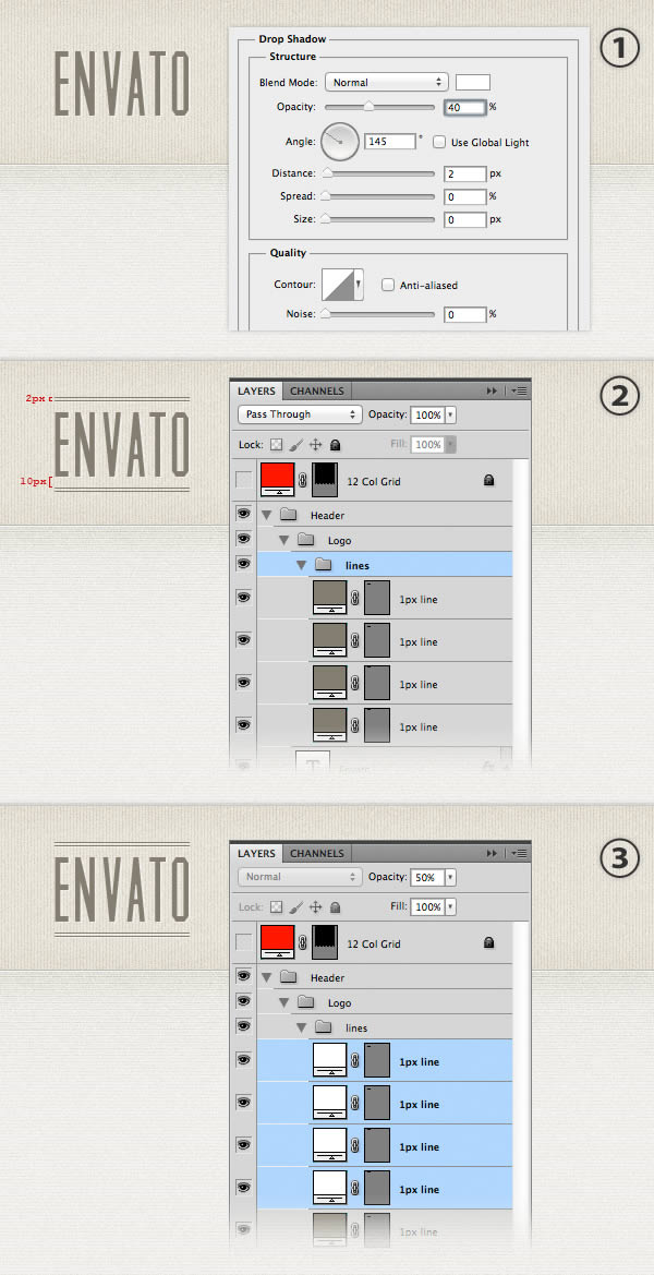
For the logo we are going to use two fonts: Muncie and Damion. Select the Type Tool (T) and write the name of your website using the font Muncie with the color #847e70 and the size 80px. Add a shadow to this layer using the settings from the image below (1). This will create a subtle highlight to the text and make it look sharper.
Use the Line Tool (U) with the foreground color #837d6f to create two lines at the top of your text layer and two others at the bottom. Name these layers "1px line" (2). Take a look at the following image for reference.
Select all 4 line layers and duplicate them by dragging them over the "Create new layer" button from the bottom of the Layers panel. Change the color of the new lines to white and set their opacity to 50%. Use the Move Tool (V) to move these lines 1px beneath the darker ones (3).
Group all the line layers together (select them and hit Ctrl/Cmd + G). Name the group "lines".
Use the Type Tool (T) to write the word "Retro" in the middle of the bottom lines. Use the font Damion with the size 21px and the color #847e70. Apply a shadow to this layer using the settings from the image below.
Now we will add the Envato logo in the middle of the top two lines. First,downloadthe "Powered By Envato API" .PSD file and open it in Photoshop. Double-click on the thumbnail of the "Vector Smart Object" and the file will be opened in Adobe Illustrator.
Select the leaf object and change its gradient colors to #847d6f and #5b574f. Use the Direct Selection Tool (A) to select the leaf and copy it (Ctrl/Cmd + C). Go back to Photoshop and paste it (Ctrl/Cmd + V) as smart object.
Go to Edit > Free Transform (Ctrl/Cmd + T), hold down the Shift key and scale this layer down. Name this layer "envato logo" and move it in the middle of the top two lines. Copy the Drop Shadow layer style from the "Retro" text layer and paste it on this one.
We want to hide the lines underneath the Envato logo and the "Retro" text layer. We can do this using a mask. Click on the "lines" group to make it active. Use the Rectangular Marquee Tool (M) to create two selections, as you see in the image below (note: hold down the Shift key after you create the first selection, so you can add the second one).
Go to Layer > Layer Mask > Hide Selection. Now the lines underneath the Envato logo and the text layer should be hidden.
Step 4: Creating the navigation bar ribbon
The navigation bar for this web design is going to be a ribbon that we will create using shapes, smart objects, noise filters and layer styles. First, create a new group and name it "Navigation". Then create another group inside the first one and name it "ribbon".
Use the Rectangle Tool (U) to create a rectangle with the dimensions 610px by 44px and the color #d8cfba. Name this layer "rectangle", right-click on it and select Convert to Smart Object. Then apply a Noise filter (Filter > Noise > Add Noise) using the settings from the image below.
Double-click on this layer to open the Layer Style window and use the settings from the image below. The pattern that I used is from theTileables Shapes Pack. The Stroke color that I used is #b1aa99.
Use the Pen Tool (P) to create the shape from the end of the ribbon. Take a look at the following image for reference (1).
Name this layer "left end" and move it underneath the "rectangle" layer. Offset this shape 10px down from the rectangle top edge and 10px to the right from the rectangle's left edge (2).
Right-click on this layer and select Convert to Smart Object. Apply a noise filter with the settings from the image below. Double-click on this layer to open the Layer Style window and use the settings from the following image (3). The Stroke color that I used is #9d9684.
Duplicate the "left end" layer (Ctrl/Cmd + J) and go to Edit > Transform > Flip Horizontal. Name the new layer "right end" and move it to the right side of the rectangle. Then set the Inner Shadow angle of this layer to 180 degrees.
Use the Pen Tool (P) with the foreground color #6c6554 to create a triangle that connects the rectangle with the ending shape of the ribbon (1). In the image below I made this triangle red to make it more visible.
Name this layer "left triangle", right-click on it and select Convert to Smart Object. Then apply a noise filter with the settings from the image below (2).
Duplicate this layer (Ctrl/Cmd + J) and go to Edit > Transform > Flip Horizontal. Name the new layer "right triangle" and move it to the right side of the ribbon.
Now we will add some shadows and highlights to the ribbon. Use the Rectangular Marquee Tool (M) to create a selection with the dimensions 10px by 44px over the left side of the rectangle (1).
Go to Layer > New Fill Layer > Gradient and use the settings from the image below. Name this layer "left highlight" and set its blend mode to Soft Light 70% (2).
Create a new selection with the dimensions 5px by 44px (3). Go to Layer > New Fill Layer > Gradient and use a #b5ae9d-to-transparent gradient (4). Name this layer "left shadow".
Duplicate these two layers and move them to the right side of the rectangle. Then change the gradient angle of these two layers to 180 degrees (5).
Now we will create a stitched ribbon effect using dashed lines. First, we will need to create a new pattern. Create a new document (Ctrl/Cmd + N) with the dimensions 10px by 1px.
Zoom in and use the Rectangular Marquee Tool (M) to create a selection with the dimensions 6px by 1px, as you see in the image below. Create a new layer and fill the selection with black.
Hit Ctrl/Cmd + D to deselect. Hide the "Background" layer and go to Edit > Define Pattern. Save your pattern and then close this document.
Go back to your web design document and create a new group inside the "ribbon" group. Name this one "dashed lines".
Use the Line Tool (U) to create a 1px horizontal line at the top of the ribbon's rectangle (1). Set the Fill of this layer to 0%. Then apply the dashed line pattern that you created earlier (2).
Name this layer "1px dashed line", right-click on it and select Convert to Smart Object. Double-click on this layer to open the Layer Style window and apply a Color Overlay effect using the color #b1aa99 (3).
Now we will add a brighter dashed line to make the stitched effect look more sharp. Duplicate this layer (Ctrl/Cmd + J) and change its color to #e4ddcd. Use the Move Tool (V) to move this dashed line 1px beneath the first one (4).
Select the two dashed line layers and duplicate them. Then move the new lines at the bottom of the rectangle (5).
Step 5 - Creating the ribbon background
Now we are going to create a background for the ribbon to make it look like it is wrapped around a wall.
Create a new group, name it "ribbon bg" and put it beneath the "ribbon" group. Use the Rectangle Tool (U) to create a black rectangle underneath the ribbon. Make sure this rectangle is placed within the two ribbon triangles. Name this layer "ribbon bg" and set its blend mode to Soft Light 20%.
Use the Rectangular Marquee Tool (M) to create a selection over the left side of the ribbon background (1).
Go to Layer > New Fill Layer > Gradient and use the settings from the image below (2). Set the blend mode of this layer to Soft Light 40% (3).
Use the Line Tool (U) with the color #b0a793 to create a 1px vertical line over the left edge of the ribbon background. Duplicate this line layer (Ctrl/Cmd + J), move the new one 1px to the right and change its color to #dbd5c6 (4).
Add the same gradient and lines to the right side of the ribbon background as well. Keep in mind that you need to set the gradient angle to 180 degrees and flip the two line layers horizontally (5).
Add a mask to the "ribbon bg" group (Layer > Layer Mask > Reveal All). Then select a linear black-to-transparent gradient (G) and mask out the top and the bottom areas of this group. In the image below you can see how my mask looks like (if you hold down the Alt/Option and click on the thumbnail of the mask, you will be able to see it over the entire image).
Step 6 - Adding the navigation items
Now we will add the navigation menu items and some retro icons next to each one. Select the Type Tool (T) and write the name for your navigation items using the font Oswald with the size 16px and the color #7f7866. To indicate the active page, change the color of the first item to a darker brown (#615c4f).
Download this set ofretro iconsand open the .AI file in Adobe Illustrator. Select each icon that you want to use and copy it (Ctrl/Cmd + C). Then go to Photoshop and paste each icon (Ctrl/Cmd + V) as a smart object. Use Free Transform (Ctrl/Cmd + T) to change the size of these layers.
Apply a Color Overlay effect to each icon using the same color that you used for the text layers. Then apply a Drop Shadow effect on all the text and icon layers using the settings from the image below.
Step 7 - Creating a "Contact us" sign
Instead of adding the contact link in the navigation bar, we will create a retro sign for it. We are going to break the proximity design principle, which states that related items should be grouped close together and have similar visual characteristics. The contact link is part of the navigation, but it will have a different style than the other navigation items to make it stand out. Keep in mind that whenever you want to break a design principle you must: a) know the principle and b) have a reason to break it.
Create a new group and name it "Contact". Select the Rounded Rectangle Tool (U), set the Radius to 4px and create a rounded rectangle with the dimensions 130px by 180px and the color #c7c1b3.
Name this layer "border", right-click on it and select Convert to Smart Object. Apply a noise filter using the settings from the image below. Double-click on this layer to open the Layer Style window and use the settings from the following image. For the Stroke effect I used the color #a9a396. The pattern that I used is from theTileables Lines Pack.
Select the Rounded Rectangle Tool (U), set the Radius to 2px and create a rounded rectangle with the dimensions 122px by 72px and the color #f3f0e8. Move this rectangle in the middle of the previous one.
Name this layer "contact bg", right-click on it and select Convert to Smart Object. Apply a noise filter using the settings from the image below. Double-click on this layer to open the Layer Style window and use the settings from the following image. For the Inner Shadow effect I used the color #a9a396 and for the Inner Glow effect I used the color #f5f2e9.
Now we will divide the sign into two parts, one for each text layer we will add later. Select the Rectangle Tool (U) and create a rectangle with the dimensions 120px by 32px and the color #eae5d9. Name this layer "top bg", right-click on it and select Convert to Smart Object. Move this rectangle at the top of the smaller rounded rectangle. Then right-click on this layer and select Create Clipping Mask.
Add a noise filter to this layer using the settings from the image below. Then add a Drop Shadow effect using the color #c3beb1 and the settings from the following image.
Now we will create a rounded rectangle with a dashed stroke. Since Photoshop does not offer the functionality for creating dashed lineyet, we are going to use Illustrator.
Open a new document in Illustrator. Select the Rounded Rectangle Tool and click on your document to bring up the Rounded Rectangle window.
Set the width to 171px, the height to 71px and the Radius to 2px. Remove the fill of this shape and add a 1pt black stroke. Open the Stroke panel (Window > Stroke) and use the settings from the following image to create a dashed stroke.
Select the rounded rectangle and copy it (Ctrl/Cmd + C). Go back to your Photoshop document and paste it as a smart object (Ctrl/Cmd + V). Name this layer "dashed line" and move it in the middle of the "contact bg" layer. Add a Color Overlay effect to the "dashed line" layer using the color #958f82.
Select the Type Tool (T) and write the words "get a free quote" in the upper section of the sign. I used the font LeckerliOne with the size 14px and the color #948f84. I chose this font instead of Damion (which we used in the logo) because it is more legible at this size.
Use the Type Tool (T) to add the words "Contact us" in the lower area of the sign. I used the font Oswald with the size 19px and the color #948f84.
Apply a Drop Shadow effect to these two text layers using the settings from the image below.
Copy one of the hand icons from theretro iconsset you downloaded and paste it in Photoshop as a smart object. Name this layer "hand icon" and move it in the middle of the two sections of the sign.
Double-click on this layer to open the Layer Style window and use the settings from the following image. For the Color Overlay effect I used the color #969183.
Now we need to add a rope to hold the sign. Create a new group, name it "rope" and move it at the bottom of the "Contact" group. Then use the Ellipse Tool (U) to create a nail. Select the Line Tool (U), set the Weight to 1px and create two oblique lines, as you see in the image below. Use the color #7f7866 for all these shapes.
Step 8 - Creating the "Services" area
For the "Services" area we will need a hexagon shape that we will use as background for the three content columns. We will create this shape using Adobe Illustrator.
Open a new document in Illustrator and select the Polygon Tool. Click on your image to open the Polygon window, where we can set the characteristics of the shape. Set the Radius to 70px and the Sides to 6. Click OK to create the shape.
Set the Fill color of the polygon to #8E8E8E. Then add a 20px Stroke using the same color. Open the Stroke panel (Window > Stroke) and set the Corner to Round Join. Then right-click on this shape, go to Transform > Rotate, set the Angle to 90 degrees and click OK.
From the option bar above your image set the width of this shape to 140px and its height to 162px.
Use the Selection Tool (V) to select the hexagon shape and copy it (Ctrl/Cmd + C). Go back to your Photoshop document and paste it as a smart object (Ctrl/Cmd + V). Go to Edit > Free Transform (Ctrl/Cmd + T), hold down the Shift key and scale this layer up until its width is 300px, or four 960 grid columns (you can see the dimensions of the shape that your are transforming in the Info panel).
Set the Fill of this layer to 0%. Then double-click on it and apply the "Dot Grid 2" pattern from the Tileables Shapes Pack. Name this layer "halftone pattern". Add this layer inside a group (Ctrl/Cmd + G) and name it "Web Design". Then create a new parent group and name it "Services".
Right-click on the "halftone pattern" layer and select Convert to Smart Object. Then apply a Color Overlay effect to this layer using the color #a7c5bd.
Copy again the hexagon shape from Illustrator and paste it in your Photoshop document as a smart object. Go to Edit > Free Transform (Ctrl/Cmd + T) and set the horizontal and vertical scale to 175% from the option bar above your image (1).
Name this layer "border" and move it to the center of the first hexagon shape. In order to align these two layers properly, make sure that you have the Smart Guides activated (View > Show > Smart Guides). Move this layer over the first hexagon shape and you will see some pink lines that indicate how the two layers are aligned.
Add a Color Overlay effect to the "border" layer using the color #a7c5bd (2).
We need to apply a noise filter to this layer. However, the Color Overlay effect will go over the noise filter. To solve this issue we will need to convert this layer into a smart object. Right-click on the "border" layer and select Convert to Smart Object. Then go to Filter > Noise > Add Noise and use the settings from the image below (3).
Double-click on this layer to open the Layer Style window and use the settings from the following image for Outer Glow. The color that I used is #89b9ac (3).
Copy the hexagon shape one more time from Illustrator and paste it in Photoshop as a smart object. Go to Edit > Free Transform (Ctrl/Cmd + T) and set the horizontal and vertical scale to 170%. Name this layer "column bg" and move it to the center of the other two hexagon shapes.
Add a Color Overlay effect to this layer using the color #f5f2ea. Right-click on it and select Convert to Smart Object. Then apply a noise filter using the settings from the image below. Double-click on this layer to open the Layer Style window and use the settings from the following image. For the Stroke effect use the color #83a098.
Step 9 - Adding the "Services" area content
Select the Type Tool (T) and write the headline "Web Design" using the font Muncie with the size 48px and the color #7b9d94. Then add a white Drop Shadow effect using the settings from the image below.
Use the Type Tool (T) to create a text box 230px wide (you can see the width of your text box as you are creating it in the Info panel). Add a paragraph of text in this box using the font Open Sans Light with the color #5c574f and the size 15px.
To make the text more legible we will set the line height to 1.6em. Our font size is 15px. If we multiply 15 by 1.6 we get 24. That is the pixel value of the line height. Go to the Character panel and set the leading to 24px.
Now we will add a "View Portfolio" button for this column. Later on we will create the "portfolio" area and we want the user to be able to select one of the services offered and get the portfolio items for that service right underneath this area.
Select the Rounded Rectangle Tool (U) and create a rounded rectangle with the dimensions 120px by 30px and the color #a7c5bd. Name this layer "button", right-click on it and select Convert to Smart Object.
Go to Filter > Noise > Add Noise and use the settings from the image below (1). Then double-click on this layer to open the Layer Style window and use the settings from the following image (1).
Select the Type Tool (T) and write the words "See Portfolio" using the font Oswald with the size 17px and the color #f9f9f9. Put this text layer in the middle of your button. Then add a Drop Shadow effect to this layer using the settings from the image below (2). The color that I used is #83a098.
Add these two layers inside a group and name it "button".
Use the Line Tool (U) with the color #cbc5b7 to create two horizontal lines underneath the headline of this column. The top line is 200px wide, the second one is 240px wide and they have a 9px gap between them. Name these layers "1px line".
Duplicate the two line layers and move the new ones 1px down. Change the color of the new lines to white and set their opacity to 40%.
Group all these line layers and name the group "lines". Use the Rectangular Marquee Tool (M) to create a selection over the area where the lines intersect with the text. Make sure that the "lines" group is active and go to Layer > Layer Mask > Hide Selection.
Create two more columns for the "Services" area just like you created the "Web Design" column. All the settings are the same, except for the colors, which you can get from the following image.
We finished the "Services" area. Here we applied the proximity and repetition design principles. We repeated the shape of each column and the fonts to indicate that the three columns are related and have similar functionalities and content.
Font choices
So far we used five fonts in this design. We can exclude the script fonts, which were used only once for different purposes and talk about the other three: Muncie, Oswald and Open Sans.
I chose the font Muncie because it is a beautifully designed condensed typeface which matches the style I wanted to create. We used this font for the logo and the "Services" area headlines. This font is not legible enough at small sizes (e.g. for the navigation bar), so I added Oswald to the mix. These two fonts go well together because they share a characteristic: they are both condensed typefaces.
For the blocks of text I chose the Open Sans font family because it comes in 10 different styles to chose from. The Light version of this font, which we will use the most, creates a nice contrast with the other fonts used.
Step 10 - Creating the "Portfolio" area
The "Portfolio" area will be linked to the services area. Since we are creating a one-page website, we need the functionality of selecting a portfolio category and get a list of the portfolio items from that category.
We are going to use the three services as categories. In order to indicate which category is selected, we will use the same color scheme that we use for the "Services" area.
When a user clicks on say, the "Branding" service, the portfolio section underneath will have a red stroke, the highlight color and headline color will also be red and there will be a red bar connecting the "Branding" column with the portfolio box. These three visual indicators will be enough for the user to quickly understand how the portfolio section works.
Let's start designing the "Portfolio" area. Create a new group and name it "Portfolio". Create another group inside this one and name it "portfolio bg".
Select the Rectangle Tool (U) and create a rectangle with the dimensions 960px by 310px and the color #89b9ac. Name this layer "first border" and set its opacity to 20%. Then select the Move Tool (V) and move this rectangle 60px underneath the "Services" area.
Create a new rectangle with the dimensions 950px by 300px and the color #a7c5bd. Name this layer "second border" and move it in the middle of the first rectangle. Double-click on this layer to open the Layer Style window and use the settings from the following image. The color that I used for the Inner Shadow and Stroke effects is #83a098.
Create a new rectangle with the dimensions 940px by 290px and the color #f5f2ea. Name this layer "portfolio bg". Double-click on this layer to open the Layer Style window and use the settings from the following image. The Stroke color that I used is #f9f8f5.
The "Portfolio" area will be dived into two columns. The left one will display a list of thumbnails. When a user clicks on a thumbnail, the right column will display more information about that portfolio item.
Now we will create the background for the right column. Select the Rectangle Tool (U) and create a rectangle with the dimensions 640px by 290px and the color #ece8df. Name this layer "active item bg", right-click on it and select Convert to Smart Object.
Add a noise filter using the settings from the image below. Then double-click on this layer to open the Layer Style window and use the settings from the following image. The Inner Glow color that I used is #9d9180.
Create two vertical lines with the weight 1px over the left edge of the "active portfolio bg" rectangle. For the dark one use the color #c3b9ab and for the light one use the color #f9f8f5.
Then select the Rectangle Tool (U) and create a rectangle with the dimensions 4px by 80px that connects the bottom of the "Web Design" column with the "Portfolio" area border. Set the color of this layer to #a7c5bd and name it "connector".
Step 11 - Adding the portfolio items
Create a new group and name it "portfolio items". Copy the hexagon shape from Illustrator and paste it in Photoshop as smart object. We are repeating the hexagon shape to maintain the same visual style throughout the entire design.
Go to Edit > Free Transform (Ctrl/Cmd + T) and set the horizontal and vertical scale to 50%. Add a Color Overlay effect to this layer using the color #f4eee7 and a 1px inside Stroke effect using the color #c3b9ab. Name this layer "border".
Duplicate the "border" layer (Ctrl/Cmd + J), right-click on it and select Clear Layer Style. Then go to Edit > Free Transform (Ctrl/Cmd + T) and set the horizontal and vertical scale to 42%. Name this layer "image_holder" and make sure it is in the middle of the "border" layer.
Open an image that you want to feature in the "Portfolio" area and move it over the "image_holder" layer. Name this layer "image", right-click on it and select Create Clipping Mask. Your image should now be visible only within the "image_holder" hexagon shape.
Put all the three layer inside a group and name it "item #1".
Duplicate the "item #1" group 7 times and arrange your portfolio items in acoroneneshape.
The fourth portfolio item has a different border color to indicate that it is selected. Simply change the Color Overlay to #a7c5bd and the Stroke color to #83a098 for that "border" layer.
Now we will add the content for the active portfolio item (the one we highlighted earlier). Create a new group and name it "active item". Select the Rounded Rectangle Tool (U), set the Radius to 4px and create a rounded rectangle with the dimensions 220px by 250px and the color #f5f2ea. Name this layer "border" and add a 1px inside Stroke to it using the color #c3b9ab.
Select the Rectangle Tool (U) and create a rectangle with the dimensions 200px by 230px in the middle of the rounded rectangle.
Open an image that you want to feature in this area, move it over the "image_holder" layer. Name this layer "image", right-click on it and select Create Clipping Mask. Now your image is visible only inside the rectangle you created.
Select the Type Tool (T) and write the name for your portfolio item using the font Oswald with the size 24px and the color #7b9d94. Move this text layer 20px to the right from the left edge of the image. Add a Drop Shadow effect to this headline using the settings from the image below.
Use the Line Tool (U) to create a horizontal line with the dimensions 370px by 1px and the color #c3b9ab. Move this line 10px beneath the headline. Duplicate this layer (Ctrl/Cmd + J), change the color of the new line to #faf9f8 and move it 1px down.
Select the Type Tool (T) and create a text box with the width 370px. Add a paragraph of text using the font Open Sans Light with the size 15px and the color #5c574f. Also, go to the Character panel and set the leading to 24px, like we did for the "Services" area paragraphs.
Step 12 - Creating the "About" area
The "About" area will contain two columns with the photo, name and description of two persons. We will continue using the hexagon shape for the photos, in order to keep the web design consistent.
Create a new group and name it "About". Copy the hexagon shape from Illustrator and paste it in Photoshop as a smart object. Go to Edit > Free Transform (Ctrl/Cmd + T) and scale down this layer until it is as wide as two grid columns. Name this layer "border", double-click on it to open the Layer Style window and use the settings from the following image. For the Color Overlay effect I used the color #d0cbc0 and for the Stroke effect I used #958f82.
Duplicate the "border" layer (Ctrl/Cmd + J), right-click on the new one and select Clear Layer Style. Then use Free Transform (Ctrl/Cmd + T) to scale down this shape. Name this layer "image_holder".
Open in Photoshop the image you want to display in this area and move it over the "image_holder" layer. Right-click on your image layer and select Create Clipping Mask.
Select the Type Tool (T) and add some content next to the image. For the headline I used the font Oswald with the size 24px and the color #a39f94. For the block of text I used the font Open Sans Light with the size 15px and the color #5c574f. I also set the leading to 24px.
Use the Line Tool (U) to create a horizontal separator between the headline and the block of text. For the first line use the color #bebbb1 and for the second one use #ffffff.
Repeat this step to add the second column for the "About" area.
Step 13 - Creating the contact form background
The "Contact" area will have two columns: one for the contact form and the other one for the Twitter feed. We will apply the contrast design principle to differentiate the two columns.
The contact form will be wider that the Twitter feed column because it is more important and it needs to attract more attention. To accomplish this goal, we are also going to create a different background to the contact form. Let's get to work now.
Create a new group and name it "Contact". Create another group inside this one and name it "contact bg". Select the Rounded Rectangle Tool (U) and create a rounded rectangle with the dimensions 620px by 360px and the color #d0cbc1. Name this layer "border", right-click on it and select Convert to Smart Object.
Go to Filter > Noise > Add Noise and use the settings from the image below. Double-click on this layer to open the Layer Style window and use the settings from the following image. The Stroke color that I used is #958f82.
Select the Rounded Rectangle Tool (U) and set the Radius to 4px. Then create a rounded rectangle with the dimensions 610px by 350px and the color #f5f2ea. Move this layer in the middle of the dark rounded rectangle.
Name this layer "contact bg", right-click on it and select Convert to Smart Object. Add a noise filter using the settings from the image below. Double-click on this layer to open the Layer Style window and use the settings from the following image. The color that I used for the Stroke effect is #f9f8f5.
Step 14 - Creating the contact form
Use the Rectangle Tool (U) with the color #faf9f8 to create three input fields and one text area for the contact form. The width of these rectangles should be 350px. We need some space in the right side of this area to add a short paragraph of text and more contact details.
For each of these rectangles apply the following layer styles. The color that I used for the Stroke effect is #d1cec7.
Add some placeholder text inside each input field. I used the font Open Sans Light with the size 13px and the color #847f76. Then add a "Send" button with the color #aea89c and the border #8a857a. Copy the other settings from a previous button you created for this web design.
Select the Type Tool (T) and create a text box next to the contact form with the width 190px. Then add a short block of text inside this box. I used the font Open Sans Light, with the size 15px, the color #5c574f and set the leading to 24px.
Select the Line Tool (U) and create a horizontal line with the dimensions 190px by 1px and the color #c8c4bb. Name this layer "1px line".
Duplicate this layer (Ctrl/Cmd + J) and move the new line 2px down. Then duplicate both of these lines and move the two new layers 1px down. Change the color of the new lines to #fcfaf6. Group all these layers together and name the group "lines".
Copy the hand icon from theretro iconsset you downloaded and paste it in Photoshop as a smart object. Use Free Transform (Ctrl/Cmd + T) to scale it down and flip it horizontally, so it points to the contact form. This way we will direct the user's eyes towards the contact form.
Move the hand icon in the middle of the lines. Then use the Rectangular Marquee Tool (M) to select the area where the lines intersect with the icon. Make sure that the "lines" group is active and go to Layer > Layer Mask > Reveal All.
Double-click on this layer to open the Layer Style window and use the settings from the following image. For the Color Overlay effect I used the color #837e70.
Use the Type Tool (T) to add another block of text beneath the lines with more contact information, such as email, phone and Skype username. For this block of text I used the fonts Oswald Italic and Semibold Italic with the size 14px, the color #5c574f and one line break between each line of text.
Step 15 - Adding the Twitter feed
Create a new group and name it "Twitter". Then use the Type Tool (T) to add a headline with the font Oswald, the size 24px and the color #a39f94.
Select the Line Tool (U) and add two horizontal lines beneath the headline. For the first line use the color #bebbb1 and for the second one use #ffffff.
Then add a couple of text boxes that represent the latest tweets. Use the font Oswald Italic with the size 14px and the color #5c574f.
Create a "Follow us" button with the fill color #a7c5bd and the border color #83a098. The other settings for this button are the same ones you applied to the previous buttons.
Advertisement
Step 16 - Adding headlines on the side of the web design
Since this is a one-page website, I thought I would add a headline next to each section to give users a feedback on which section is currently visible, in addition to the navigation bar feedback.
Create a new group and name it "Headlines". Then select the Line Tool (U) and create a vertical line from the top of the "Services" area to the bottom of the "Contact" area. Move this line 20px to the left from the left edge of the website. Name this layer "1px line".
Duplicate this layer (Ctrl/Cmd + J) and move the new line 1px to the left. Then set its color to #fbfbfa.
Select the Type Tool (T) and write the name of each section of the website next to it. Take a look at the following image for reference. I used the font Muncie with the size 36px and the color #b5b2ac. Apply a Drop Shadow effect to the text layers using the settings from the image below.
Create a new group and name it "Copyright". Then select the Type Tool (T) and add a copyright statement at the bottom of the website. I used the font Open Sans Regular with the size 12px and the color #837f79.
Conclusion
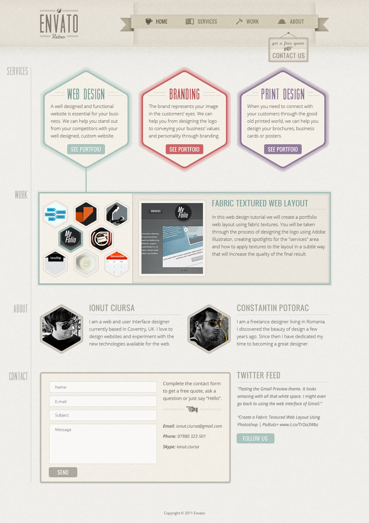
In this tutorial we aplied the four basic design principles: contrast, repetition, alignment and proximity to create a clean retro web design. I hope you enjoyed ir. Click on the following image to see the full-size version of the design.


0 comments:
Post a Comment