Clip Hay Chọn Lọc

Showing posts with label Luyện Illustrator. Show all posts

Vẽ Đoremon Lần 1 Căn Bản Bằng Illustrator

Vẽ Doremon Lần 1 Bằng Illustrator   Ngày 22/05/2015


Vẽ Đoremon Căn Bản Bằng Illustrator

Vẽ Doremon Bằng Illustrator   Ngày 22/05/2015 


Vẽ Giọt Mưa Căn Bản Bằng Illustrator

Vẽ Giọt Mưa Bằng Illustrator 
Ngày 03/05/2015

Vẽ Mắt Lần 3 Căn Bản Bằng Illustrator


Vẽ Mắt Lần 3 Bằng Illustrator 
Ngày 03/05/2015

Vẽ Mắt Lần 2 Căn Bản Bằng Illustrator

Vẽ Mắt Lần 2 Bằng Illustrator 
Ngày 03/05/2015


Hướng Dẫn Sử Dụng Từng Công Cụ Illustrator - Phần 1

Công cụ: Line Segment Tool
Cách dùng: Chọn Line Segment Tool trong thanh Control bên trái, sau đó vẽ các đoạn thẳng, đường nghiêng tùy ý. Nhấn thêm phím Shift để đoạn thẳng và đường nghiêng được rõ nét. Muốn tô màu đường thẳng hoặc đường nghiêng thì ta chọn bảng màu bên phải có đường biên rồi chọn màu muốn tô. 
----------------------------------------------

Công cụ: Arc Tool
Cách dùng: Chọn công cụ Arc Tool bên thanh Control bên trái, sau đó vẻ các đường cong, đường cong khi bấm phím Shift là 90 độ, còn nếu không bấm phím Shift thì đường cong không được vẽ theo mẫu nên không được 90 độ. Tô màu tương tự.
----------------------------------------------
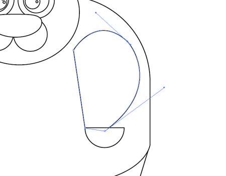
Công cụ: Spiral Tool
Cách dùng: Chọn công cụ Spiral Tool trong thanh Control bên trái, sau đó vẽ các đường xoắn ốc như mẫu, nếu chọn thêm phím Shift thì hình dạng vẫn không thay đổi, tuy nhiên nếu nhấn thêm phím Ctrl trong lúc vẽ thì sẽ thay đổi đường xoắn ốc theo ý muốn như hình trên. Lưu ý là khi nhấn phím Ctrl rồi vẽ tiếp đường xoắn ốc tiếp theo sẽ bị đứt quản và bây giờ nó không phải là đường xoắn ốc nữa mà chỉ là môt đường cong ví dụ như trên hình vẽ.
----------------------------------------------
Công cụ: Retanggular Grid Tool
Cách dùng: Chọn bên thanh Control và vẽ không theo định dạng, nhấn thêm phím Shift để vẽ theo định dạng.
---------------------------------------
----------------------------------------------
Công cụ: Polar Grid Tool
Cách dùng: Chọn bên thanh Control và vẽ không theo định dạng, nhấn thêm phím Shift để vẽ theo định dạng.
----------------------------------------------
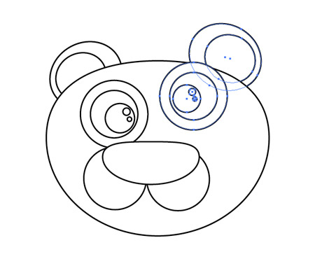
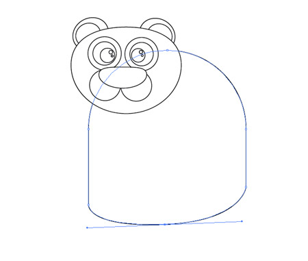
Công cụ: Vẽ Các Hình Dạng
Cách dùng: Chọn bên thanh Control và vẽ không theo định dạng, nhấn thêm phím Shift để vẽ theo định dạng.
----------------------------------------------
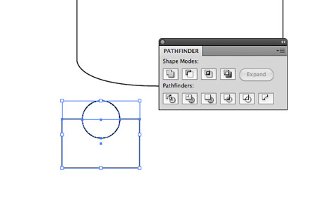
Chức năng: Unite Có nghĩa là kết hợp hay hợp nhất hai đối tượng lại với nhau. Hoặc nhiều hơn hai đối tượng trở lên.
Đối tượng nào năm trên thì màu của đối tượng đó sẽ được tô cho cả nhóm kết hợp với nhau.
----------------------------------------------
Chức năng: Minus Front có nghĩa là trừ đi phần trước hay trừ đi đối tượng nằm trên, nếu đối tượng năm trên có phần nào giao với đối tượng nằm dưới thì phần giao nhau đó sẽ cắt đối tượng nằm dưới.
Đối tượng nằm trên đã được xóa đi và phần giao nhau với đối tượng nằm trên đã được xóa đi, hay nói khác đi chức năng Minus Front này làm đối đối tượng nằm trên giống một cục gôm, tẩy đối tượng nào nó đè lên.
----------------------------------------------
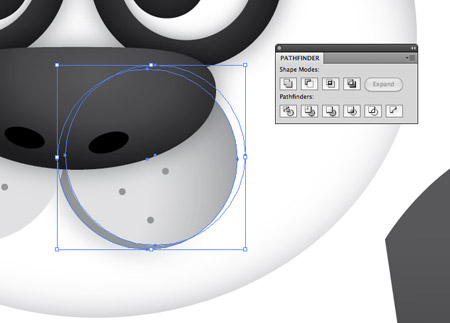
Chức năng: Intersect có nghĩa là cắt nhau, nếu hai hay nhiều đối tương nằm chồng lên nhau thì khi sử dụng chức năng Intersect sẽ cắt các phần giao nhau đó.
Hai đối tượng có phần giao nhau đã được cắt như hình trên
---------------------------------------------
Chức năng: Exclude có nghĩa là loại trừ, nếu hai hay nhiều đối tượng nằm chồng lên nhau thì khi dùng chức năng Exclude sẽ xóa đi màu sắc của phần các đối tượng giao nhau. Và sẽ tôi màu cho đối tượng nằm dưới giống màu đối tượng nằm trên.
Như hình trên thì phần giao nhau của hai đối tượng đã được xóa bỏ sắc phần gia giau đồng thời tô màu cho đối tượng nằm dưới cùng màu đối tượng nằm trên.
----------------------------------------------


Được viết bởi: Tân
Ngày: 01/05/2015

Vẽ Quả Táo Căn Bản Bằng Illustrator

Vẽ Quả Táo Bằng Illustrator 
Ngày 27/04/2015

Vẽ Ốc Sên Căn Bản Bằng Illustrator

Vẽ Ốc Sên Bằng Illustrator 
Ngày 27/04/2015

Vẽ Ong Căn Bản Lần 2 Bằng Illustrator

Vẽ Ong Lần 2 Bằng Illustrator 
Ngày 27/04/2015


Vẽ Ếch Căn Bản Bằng Illustrator

Vẽ Ếch Bằng Illustrator 
Ngày 26/04/2015 


Vẽ Gấu Koa La Căn Bản Bằng Illustrator

Vẽ Gấu Koa La Bằng Illustrator 
Ngày 22/04/2015

Vẽ Ong Căn Bản Bằng Illustrator

Vẽ Ong Bằng Illustrator 
Ngày 22/04/2015


Vẽ Mắt Căn Bản Bằng Illustrator

Vẽ Mắt Bằng Illustrator 
Ngày 22/04/2015 

Vẽ Gấu Trúc Căn Bản Bằng Illustrator

Vẽ Gấu Trúc Bằng Illustrator 
Ngày 22/04/2015

Create a Cool Vector Panda Character in Illustrator


Read the article
This post was originally published in 2010
The tips and techniques explained may be outdated.
Adobe Illustrator is my favourite tool for creating fun and cute character designs. With just a few simple shapes, a mix of gradient colours and a few shadows here and there you can build some great looking illustrations. Here’s a step by step walkthrough of the process used to create a cool Panda character, from the basic outlines through to the detailed final design.

Evolution of Panda
The character we’ll be building today started out as a mockup of a series of random shapes quickly put together in Illustrator. This provides the foundation upon which multiple gradients and colours can be overlaid to build up a recognisable character. Then, when everything is coming together and looking how it should, a few extra touches in the form of shadows can really help add that extra level of depth and realism. Here’s how it’s all done from the very start…

Open up Adobe Illustrator and create a new document. Draw a circle onto the artboard, then drag the topmost point downwards with the Direct Selection Tool to squash the circle slightly.

Draw another circle, this time a little smaller to represent the nose. Drag the topmost point of this circle to also squash the circle into an irregular shape.

Add a couple of perfectly round circles to flesh out the muzzle area, ensuring they meet in the centre.

A range of circles can build up the eye area. Draw a large overall circle, then copy (CMD+C) and paste in place (CMD+F), then scale downwards while holding Shift and Alt. Use a circle for the outline of the eye, the pupil, then a couple of smaller highlights.

Use more circles to build an ear, using the shortcut CMD+Shift+[ to send the circles to the back of the stack. Copy the ear and eye, reflect (Object > Transform > Reflect) and position on the opposite side.

The main body of the Panda originates from a large rounded rectangle. Press the upwards cursor key repeatedly to maximise the corner radius.

We don’t want the rounded corner on the lower portion, so draw a temporary shape to use along with the Minus Front option from the pathfinder tool.

Use the Pen Tool to then add an extra point in the centre of the lower edge. Then drag this point downwards while holding CMD with the Pen tool (this temporarily switches to the Direct Selection Tool).

Hold the Alt key, then drag outwards from the point. This will create bezier handles that will allow you to tweak the curvature of the bottom edge.

Draw a small circle elsewhere on the artboard, then position a temporary rectangle covering half the shape. Use the Minus Front option from the Pathfinder palette to cut away the shape.

Position the two semi-circles as feet, then draw the outline of the legs with rough clicks of the Pen tool. Match up the top corners with the edges of the body, then press CMD+Shift+[ to send to back.

Paste in another copy of the semi-circle, but this time rotate it by 180 degrees and scale it up slightly for use as a paw.

Use the Pen tool to roughly draw the rest of the arm. Drag the bezier curves to add a flowing curved edge.

Duplicate the arm, reflect then position it on the opposite side. Send this arm to the back so it creeps out from behind the body.

With the outlines complete, it’s time to add some colour. Clear the stroke from the head, then replace the fill with a white to grey gradient. Adjust the settings to Radial and bring the white slider close to the grey to maximise the amount of white. Use the Gradient tool to drag, squash and position the gradient accurately over the head to give the desired colouring.

Continue replacing the fill of all the individual elements with gradients. Any black areas should use a dark grey to black gradient and the angles adjusted as necessary with the Gradient tool.

The two circles that make up the muzzle can be adjusted so that a gradient flows to grey to transparency to give a subtle effect. Adjust the angles so that the gradient starts from the centre then flows outwards.

Draw in a few extra details such as a few circles to represent whiskers. Position them on each side of the muzzle with a mid-grey fill.

Duplicate a circle from the muzzle and nudge inwards slightly. Paste in another copy of the circle and use this as a tool along with the pathfinder to cut away the excess. This leaves a thin crescent that can be filled with a dark grey to emphasise the mouth.

Position a copy of the crescent on the opposite side, and finish off the facial area with a couple of black circles to represent the nostrils.

Add a similar white to grey gradient to the body, adjusting the angles as necessary. Also add an Inner Glow (Effect > Stylize > Inner Glow) of grey to extend the shading around the edges of the body, so that the outlines stays prominent.

A simple circle with a soft and subtle grey to transparent gradient can quickly create a chest area for the Panda.

Fill all the limbs with the black to dark grey gradient, adjusting the angles so that the gradients flow vertically.

All the colour is now in place and the character is recognisable, but there’s some finishing touches that can really help the design stand out. Add a soft Drop Shadow (Effect > Stylize > Drop Shadow) to the outline of the eyes and the nose. Use subtle settings of 30% opacity, 0 offset and 1mm blur.

Duplicate the outline of the head and squash slightly. Fill it with black then add a Gaussian Blur (Effect > Blur > Gaussian Blur) with settings of around 30 pixels.

Press CMD+[ repeatedly until the black object appears under the head, but above the body. Reduce the Transparency right down to 10% to create a subtle shadow.

Repeat the process with the arm and hand graphics. Merge the two shapes with the Pathfinder tool, fill with pure black, add a Gaussian blur, adjust the stacking order then reduce the opacity.

These little shading techniques really help add depth to the character, allowing certain elements to jump from the screen.

Use the Pen Tool to draw a rough branch shape from the Panda’s paw.

Fill the branch with a green gradient, then add ribs along its length with rough shapes with the Pen Tool.

Continuing with the Pen Tool, draw some curved shapes to represent a few leaves. Click and drag the first point, followed by a single click at the tip. Click the point once again to reset the curves, then complete the path back at the start.

Copy the whole branch of bamboo, merge together, fill with black, add the Gaussian Blur then position it as a shadow across the Panda’s body.
Final vector Panda character
A simple radial gradient in the background soon renders our cool little Panda character complete! What started off as a few basic shapes is now a full-on character complete with variations of shade and tone.